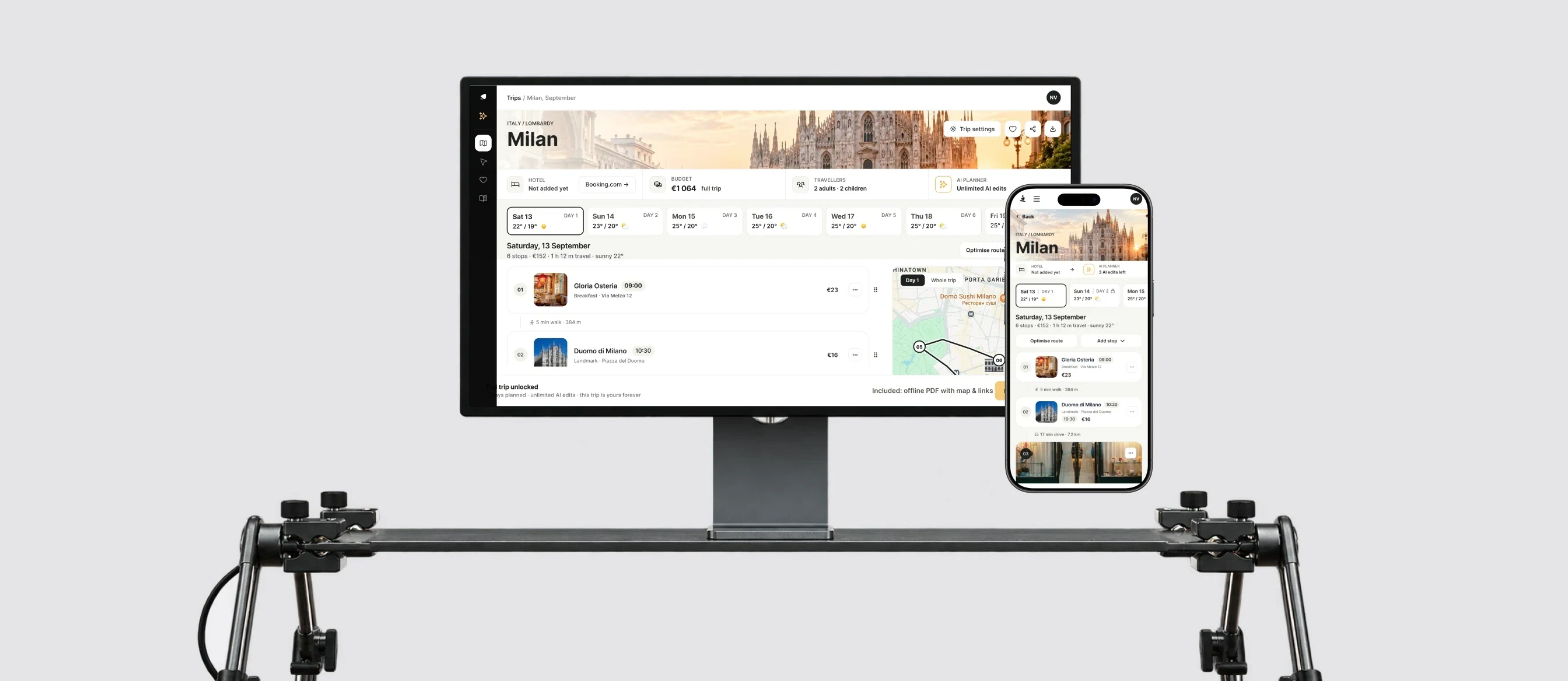
Before us, Roman had built the app on his own. The design had aged, the branding had changed, and new services had no place to go.
So it was a redesign, not a facelift: a new system, a new home screen, sign-in and transport, plus services the app never had. We worked on the app for 10 months; the first MVP in the new design went live in a month and a half.
Constraints: releases alongside development, no research with people, and text size in the accessibility modes is calculated by developers with a formula.
My role
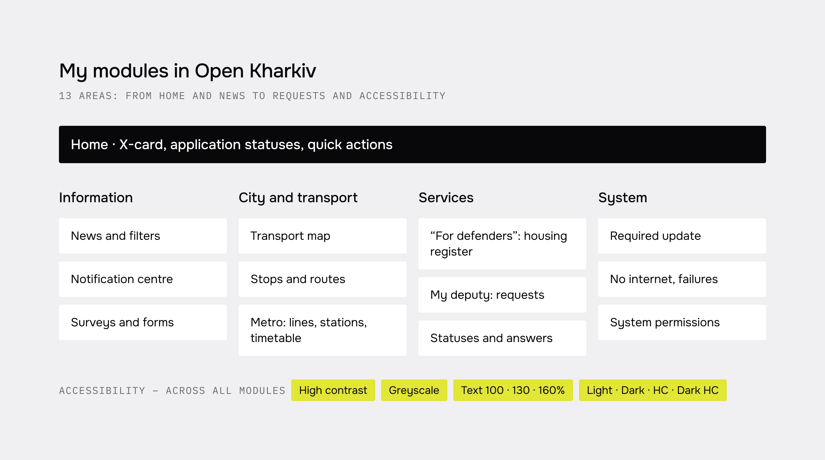
Roman and I ran flows in parallel and reviewed each other’s work; the brand book, icons and animations are his. Fully mine: the UI kit and styles, accessibility, sign-in, the Invincibility map, and the redesign of news, surveys and the card application. We took the first versions of maps and transport through together.
What changed
| Area | Before | After |
|---|---|---|
| Home | The same tiles for everyone | Adapts to the person: signed out, no card, with a card |
| Card statuses | Text on a banner, “call the hotline” | A reason and an action: “Fix the application”, “Contact support” |
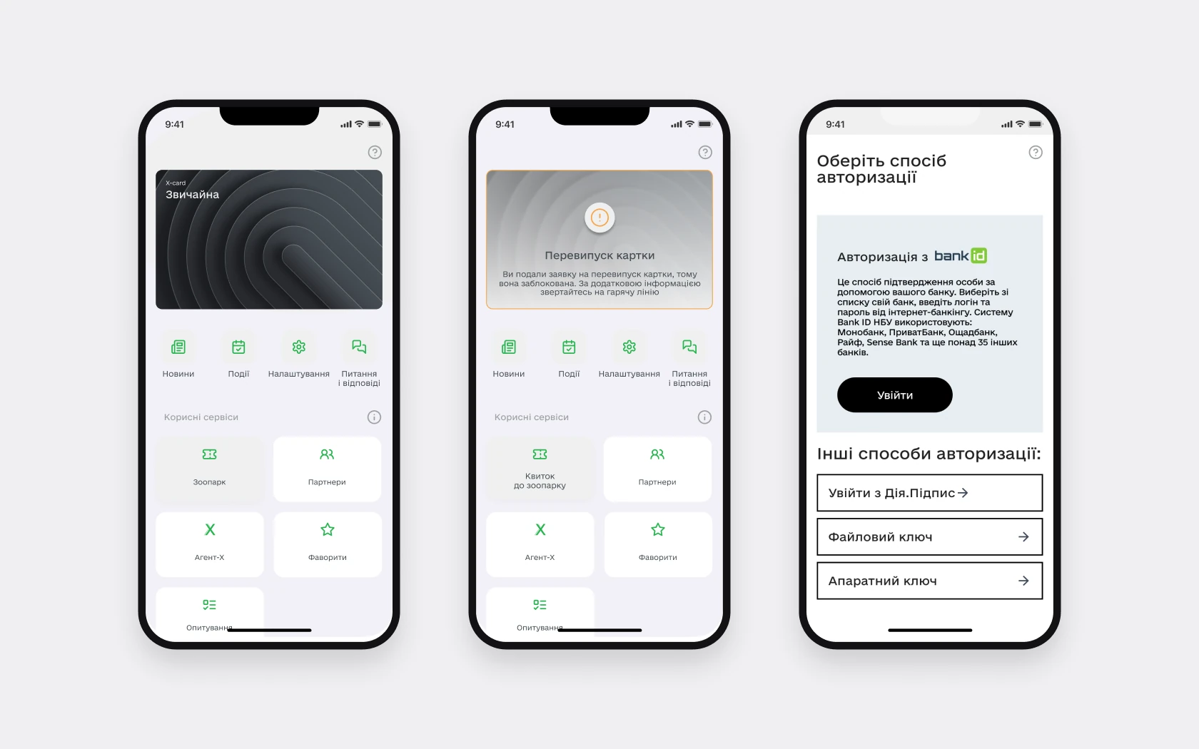
| Sign-in | A paragraph about BankID, other methods as rows | Methods grouped, 17 new states – errors, returning sign-in, code reset |
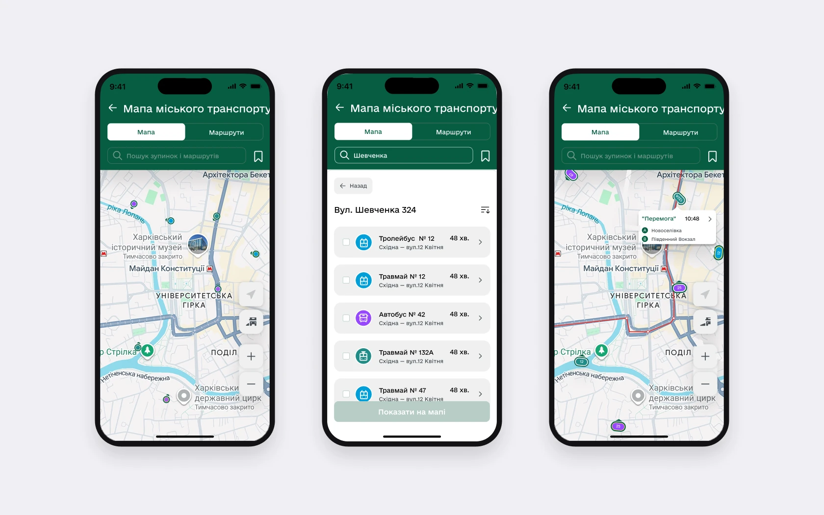
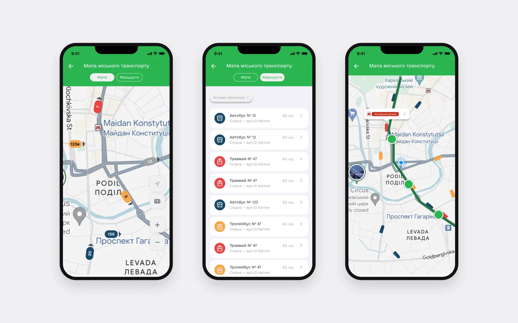
| Transport | A map with route numbers and one shared list of routes, no metro | A map, stop routes with timetables, metro with lines |
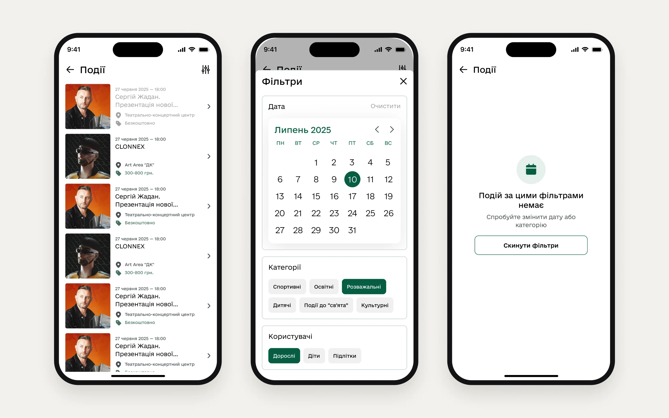
| News and events | Each filter on its own screen | All filters on one screen |
| Accessibility | None | Text at 100, 130 and 160%, four colour modes |
| New services | – | “My deputy”, “For Defenders”, the Invincibility map, a notification centre |
Accessibility and system
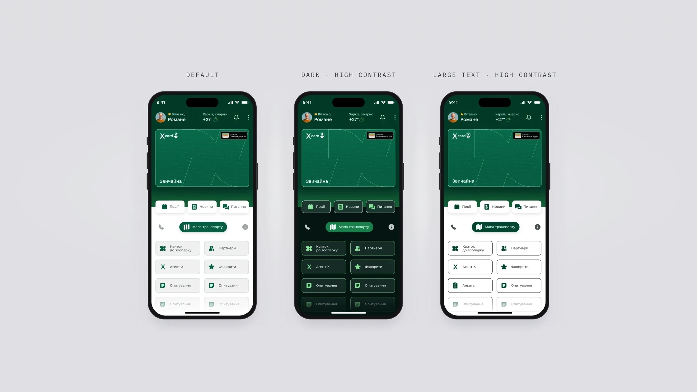
Accessibility is part of the system, not a feature at the end: high contrast, greyscale and text at 100, 130 and 160%, with cards growing with the text. Underneath are 48 semantic tokens in four modes, so a theme or contrast mode is a mode switch, not a new set of mockups. Buttons are 48 px: the client asked for narrower ones and accepted 48 after I argued with the standards.
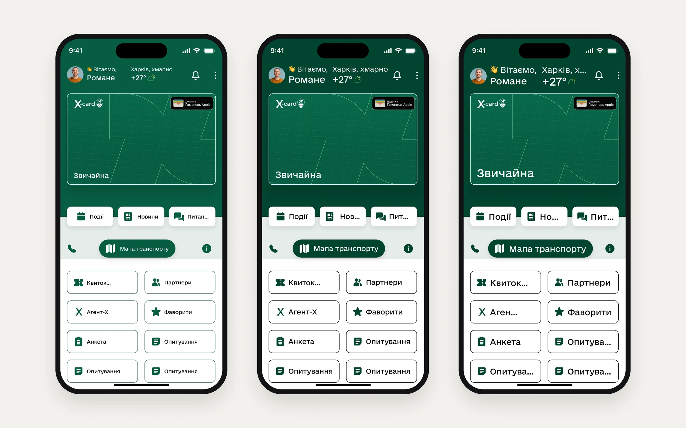
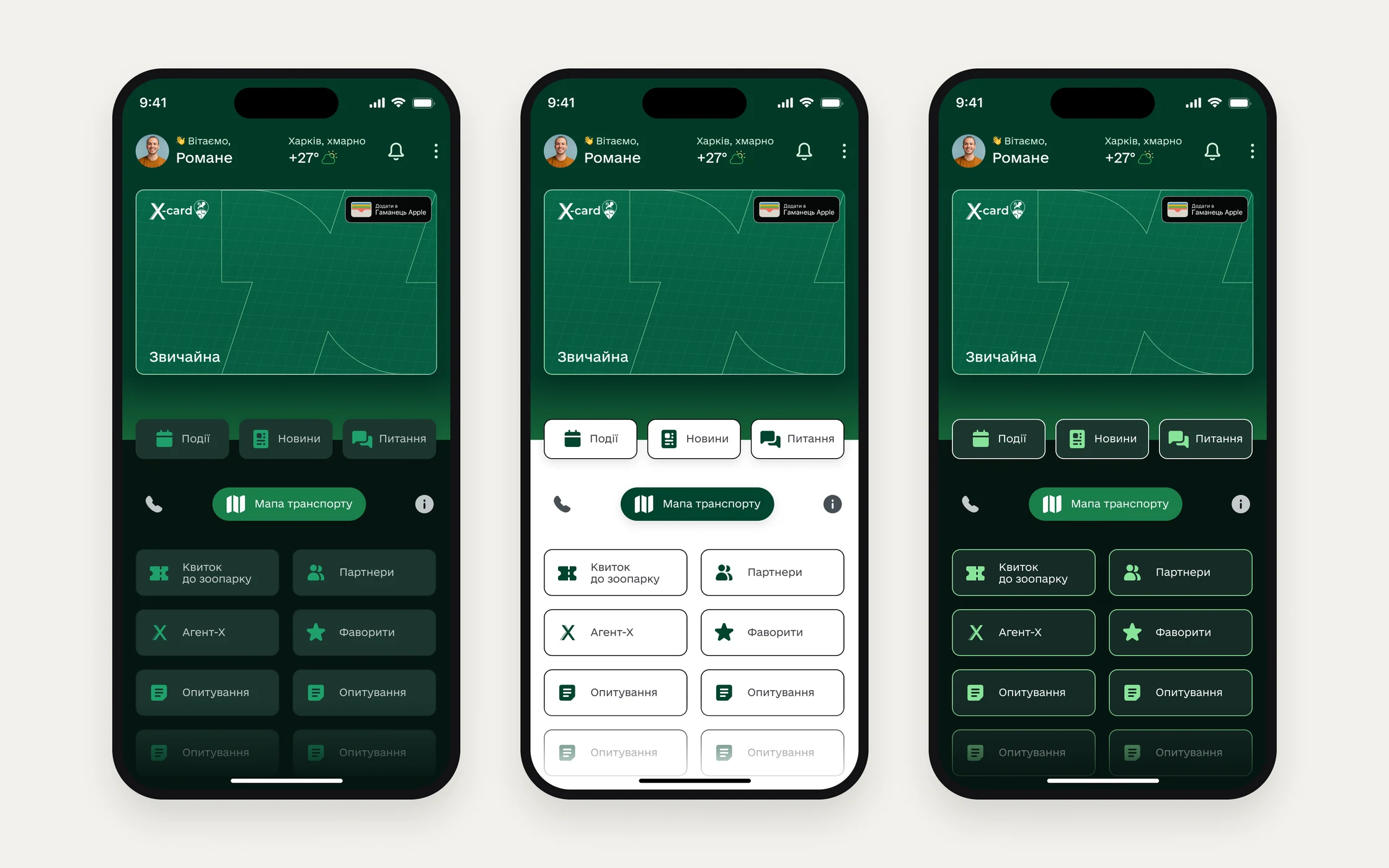
The home screen adapts to the person
- Why
- People open the app signed out, without a Kharkiv resident card, with a card, or with an application under review or rejected. The old home showed the same tiles to everyone.
- What I did
- Home changes with the state: news and “Sign in with ID.GOV.UA”, news for people without a card, the X-card and quick actions for people with one.
- Result
- Everyone sees their own next step instead of the same set of tiles.
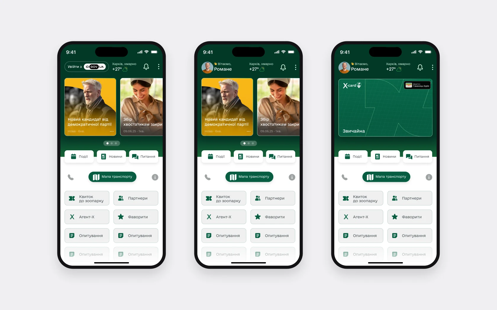
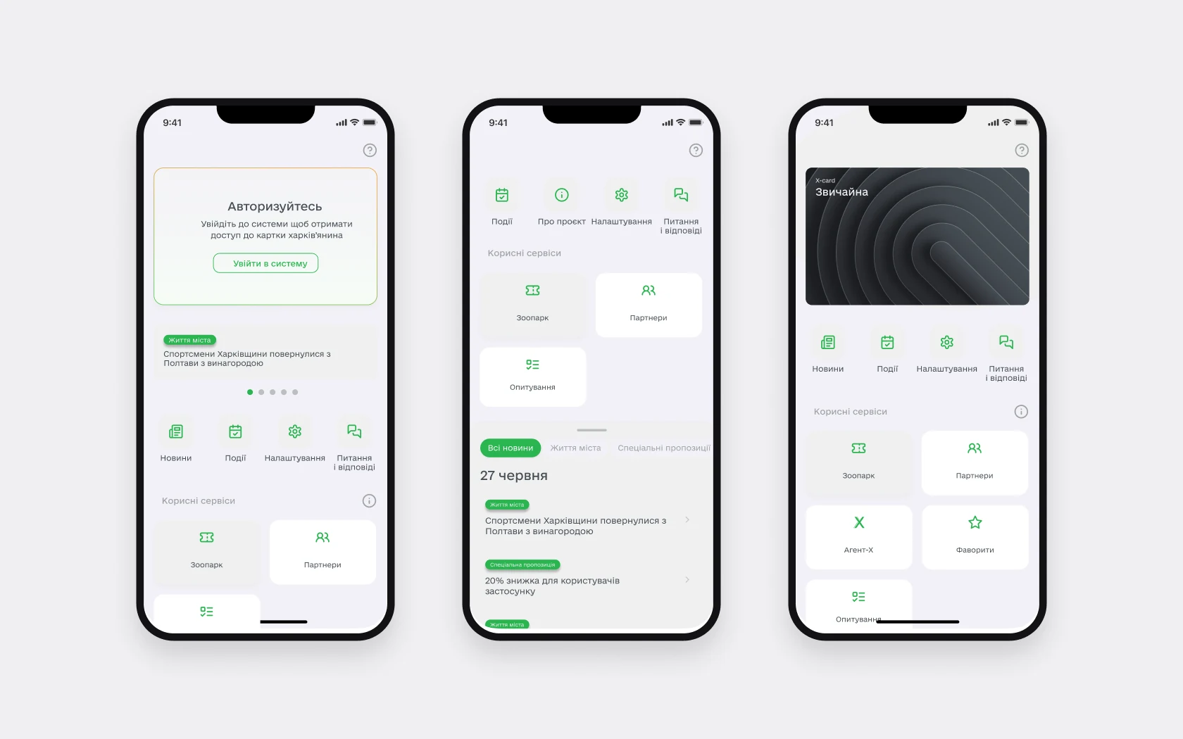 BeforeAfter
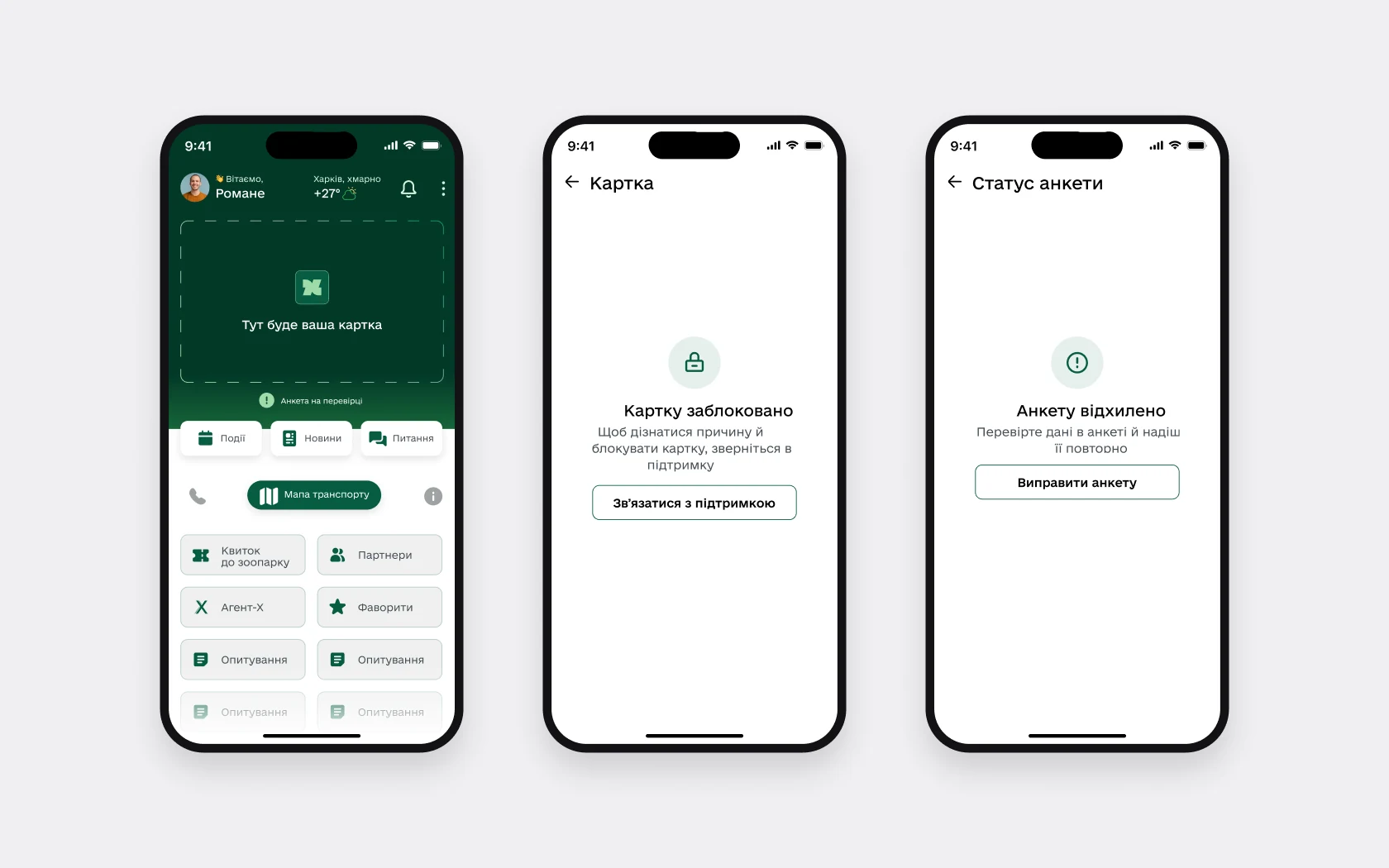
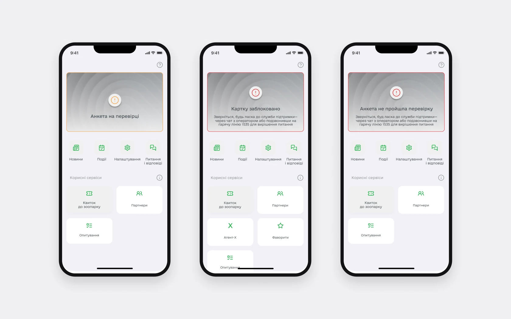
A card status always has a next step
- Why
- In the old version a status was text on a banner. A blocked card said “call the hotline”, and there was nothing else to do in the app.
- What I did
- A screen for each status: what happened and what to do. Application rejected – “Fix the application”; card blocked – “Contact support”. A placeholder for the card while the application is under review.
- Result
- A rejection or a block is no longer a dead end: the action is right on the status screen.
 BeforeAfter
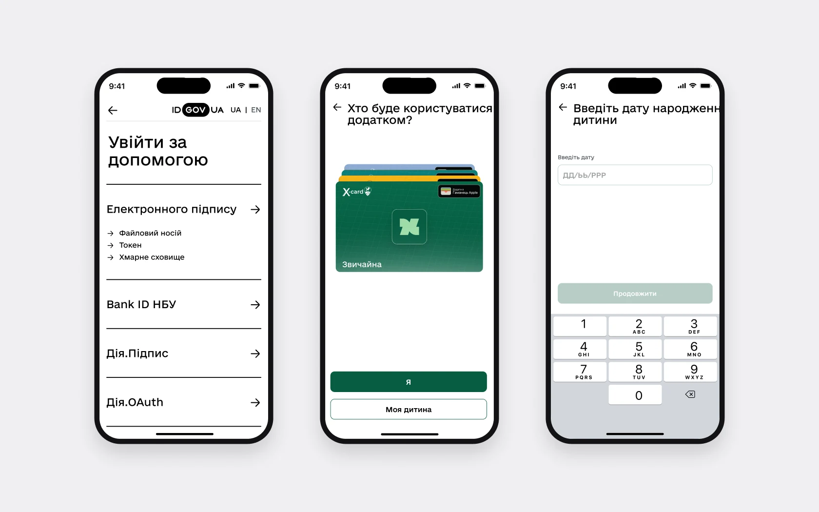
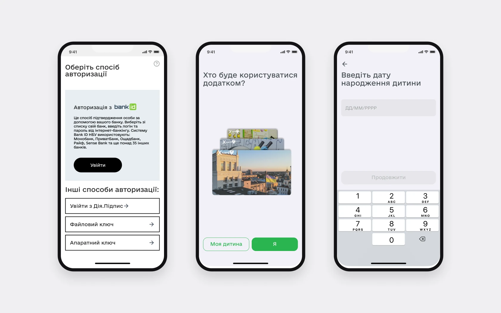
Sign-in: the same methods, a clearer choice and every state
- Why
- The old sign-in opened with a paragraph about BankID, with the other methods as identical rows below.
- What I did
- Sign-in through ID.GOV.UA with grouped methods: e-signature (file, token, cloud storage), Bank ID NBU, Diia.Signature, Diia.OAuth. A “Me” or “My child” choice, date of birth, secure sign-in with a code and biometrics.
- Result
- 17 new states that weren’t there before: expired code, too many attempts, no internet, sign-in cancelled, passport not found, session ended and more.
 BeforeAfter
Transport and metro
- Why
- Names and CTAs were unclear, search and timetables needed rework, and end stations had no scenarios of their own, and the app had no metro at all.
- What I did
- New names and CTAs, search, timetable structure, end-station scenarios, a new metro section with lines, timetables and exits, a limit on saved routes. Separate states: air-raid alert on the map, offline, location off.
- Result
- The metro shows directions, weekday and weekend timetables and open exits; the map shows accessible transport.
StatusThe flows were approved by the client. The timetable was reworked several times at their request; no testing with people.
 BeforeAfter
Prototype
Transport map, route search and news
Screens from the final design. The prototype plays on its own; switch to “Try it yourself” to click through it.
- Home
- Transport map
- Stop search
- Routes at the stop
- Route details
- Route on the map
- News and events
New, not there before
The old version had none of these services. The biggest of mine are requests to a deputy and the “For Defenders” booking.
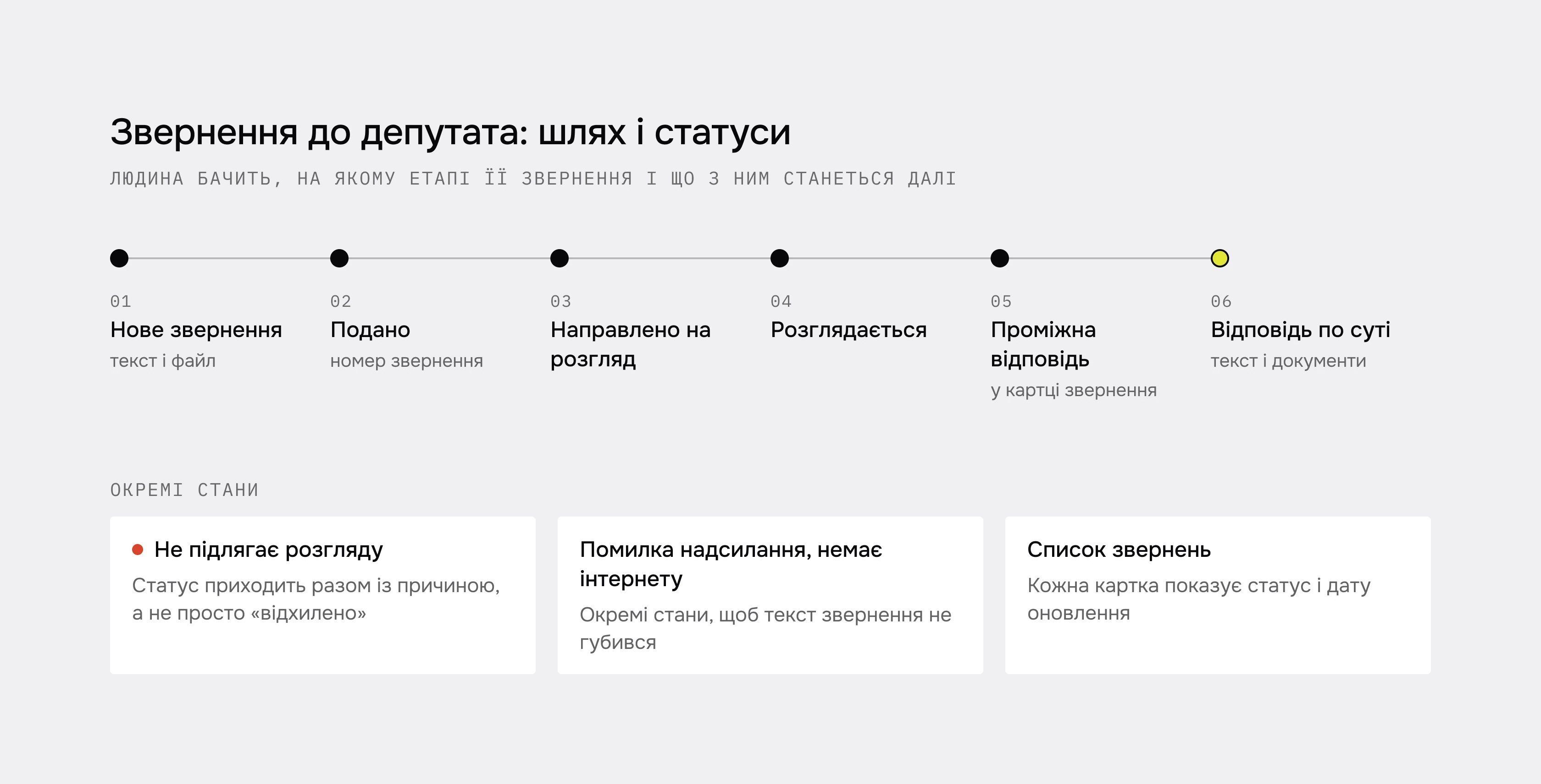
“My deputy”: requests with clear statuses
People sent a request and didn’t know what was happening with it or where to find replies. Now there are statuses, a reason if a request isn’t reviewed, and the whole reply history in the request card, with documents and a rating.
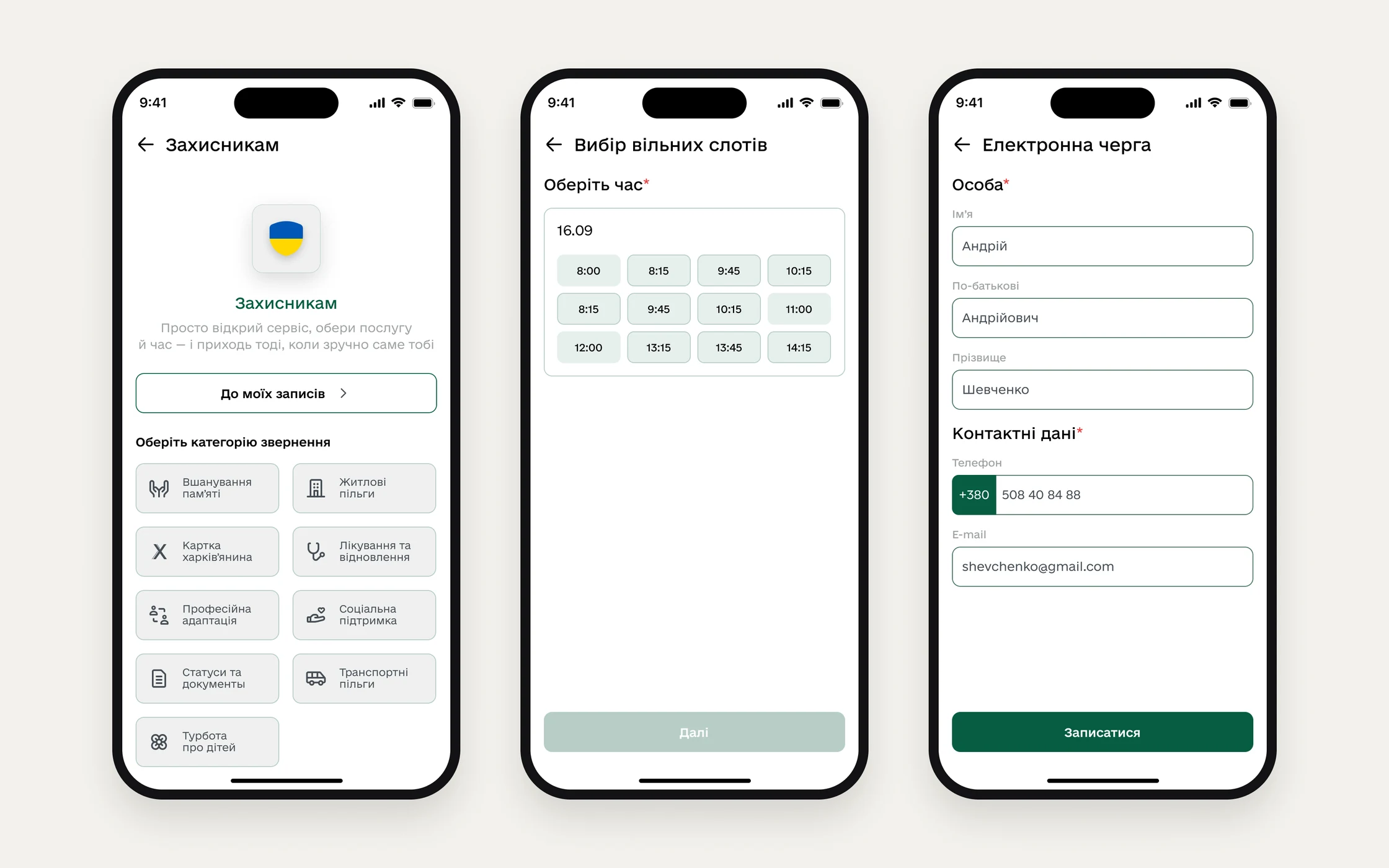
“For Defenders”: booking a visit from the phone
You pick a request category, read the service description, choose a date and a free time slot and fill in the applicant’s details. After booking there’s a ticket with the details, and the booking appears in the list on the service home. Institutions can be found on a map or in a list, filtered by district and type. Separate states: no free time on the date, booking failed, booking cancelled by the institution, missed visit.
Filters on one screen, text you can read
Each event filter used to open as a separate screen. Now all filters are on one screen, and selected ones clear with one tap. Headings 26 px, body 16 px, buttons 48 px.
- 01
A city app holds together through shared rules: I turned 33 colours from the approved screens into styles and merged the toasts into one component, and news, transport and requests began to behave the same way.
- 02
Not everything was accepted: I proposed surveying people about what Home needs and making it lighter, but Home stayed as approved.
- 03
Without research, approval didn’t answer whether things got easier. Next I’d test transport search, request statuses and the enlarged-text interface with people.