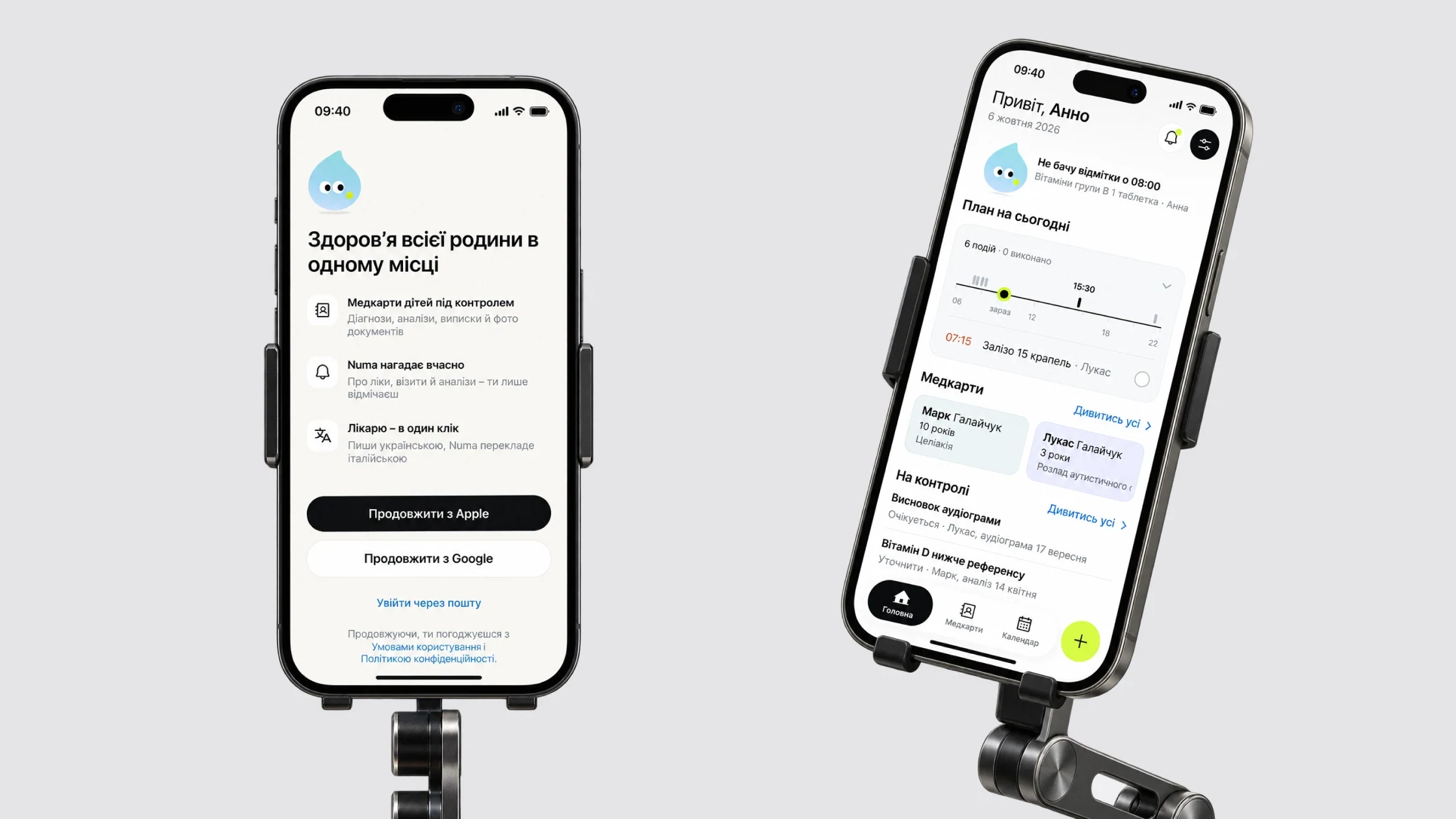
Every day a mom has to keep several kids’ medications and appointments in her head – and at the doctor’s, find the right test result in a minute and hand it over.
The goal: one app where the daily plan and the medical history live side by side without mixing. Constraints: I work solo, with no client, and the data is medical and about children.
What the survey and tests showed
Main problem – storing and finding medical records easily
73% still keep paper cards and certificatesWant to share medical data
→ decision 04: a record for the doctorWant to store family members’ data
32% – children’s profiles specifically → decision 02: “For whom”Don’t keep records digitally but would start if it’s convenient and safe
→ decision 03: passwordless sign-in and consent as a separate step65% had never used medical apps before, so simplicity matters as much as features: 68% chose it, 57% chose security.
A survey of 37 people showed what to store and what was missing, 6 in-depth interviews gave me personas and a CJM, and usability tests of the first version with five participants showed where people got stuck. Most got through navigation unaided – what had to change was sign-in, health record creation and tone.
Hypotheses that changed the design
| № | Hypothesis | Result | What it changed |
|---|---|---|---|
| 1 | People want to keep medical data digitally so they don’t lose paper documents | Confirmed Most keep documents on paper, often lose them and want a digital format | Records and documents are the core of the MVP → decision 04: a record you can hand to a doctor |
| 2 | Reminders about medication and doctor visits matter to people | Confirmed Most forget their medication and want automatic reminders | → decision 01: the day plan on Home, missed items are highlighted |
| 4 | Active users want integration with Google Health and Apple Health | Confirmed People who actively use trackers expect it | Igor isn’t the primary persona, so integrations moved to after the MVP |
| 8 | Most don’t trust storing medical data digitally | Not confirmed Most are ready to store data digitally if security is guaranteed | → decision 03: consent and 18+ confirmation as a separate step |
Other hypotheses
| 3 | Moms need a convenient way to keep vaccination history | Confirmed Moms said they often lose vaccination records |
| 5 | People want to get test results quickly in digital form | Confirmed Most want to get results online |
| 6 | People will pay for premium features if they make things easier | Not confirmed Most aren’t ready to pay and expect free features |
| 7 | How people manage health depends on lifestyle and age | Partly Some store medical data more often, others use fitness apps more |
Personas and CJM
The interviews produced two personas, each with a CJM from need to outcome. Anna is the primary one: the MVP is built around her. Igor’s needs – Apple Health integration and analytics – I moved to after the MVP.
Anna, 26 – mom of two
- Goals
- All the kids’ medical records in one place, reminders about vaccines and medication, less time spent looking for documents
- Pains from the CJM
- Chaotic records and no quick way to find things, the risk of missing important events, lots of data to enter at sign-up and input errors, fear of losing data
Igor, 37 – works in IT, an active user
- Goals
- One place for all his data, integration with Google Health and Apple Health, automatic reminders about tests
- Pains from the CJM
- Scattered data, entering parameters by hand, a complicated integration and sync setup, no analytics – just a list of records
What the user tests showed · 5 participants
Left – what the first version’s tests found, right – how Numa does it now
A wrong password was part of the scenario: recovery went smoothly, but people reached for Google sign-in, and some wanted to reset the password straight away
No password: Apple, Google or a code by email
They looked for “create” at the top or in “My records” and didn’t notice the “+” at the bottom right away
The first record is created in onboarding, “Add record” sits right in the row of records
The “None” option was easy to miss and misread
Name, date of birth and sex are enough to start, an empty field reads “Not specified”
People suggested a helper character and a warmer tone themselves, some were afraid to “break” the prototype
The Drop voices the state of the day and suggests the next step
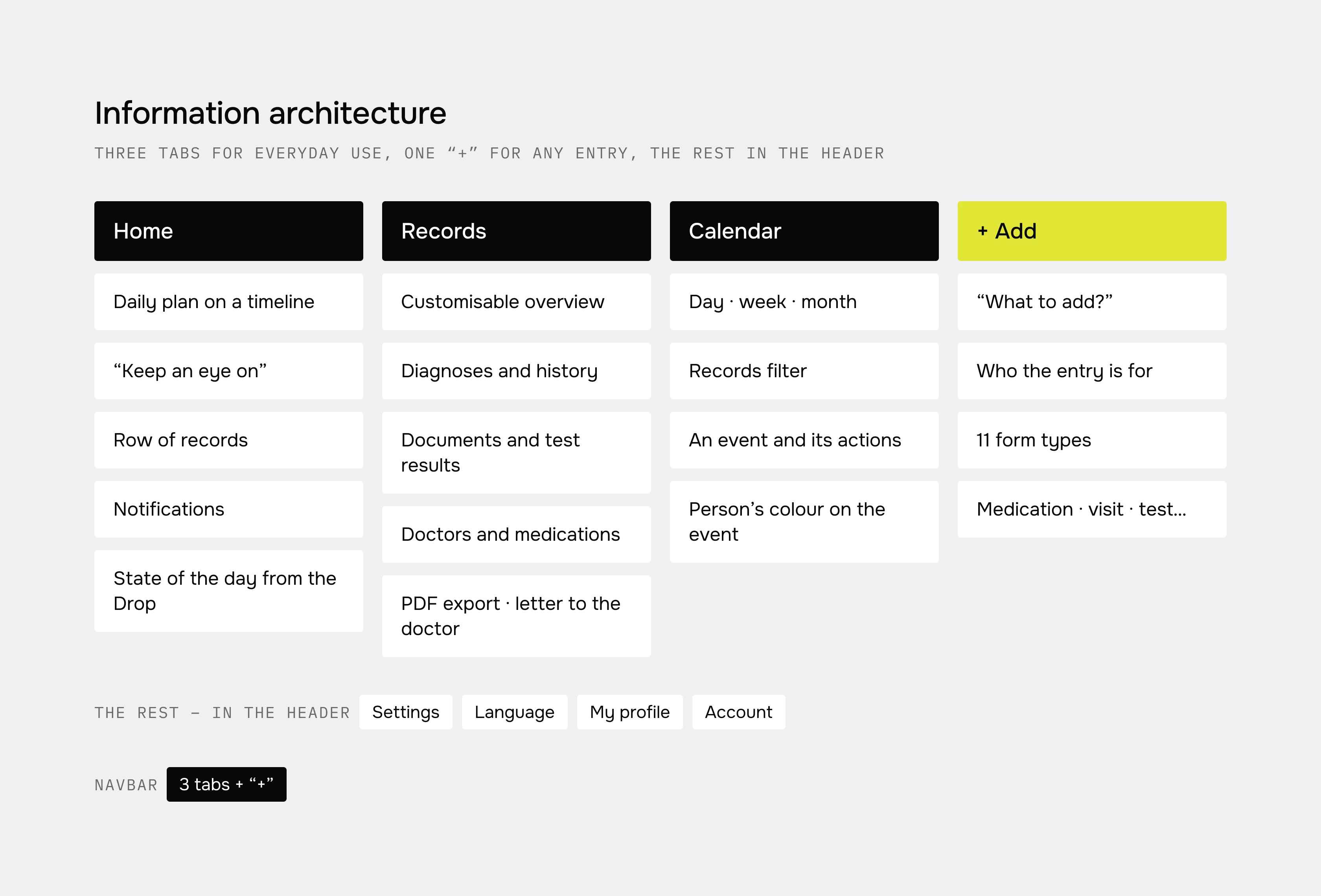
Three tabs for everyday use – Home, Records, Calendar – and one “+” for any entry. The MVP has health records, the daily plan, documents and the letter to the doctor. Shared access and Numa AI are deliberately postponed.
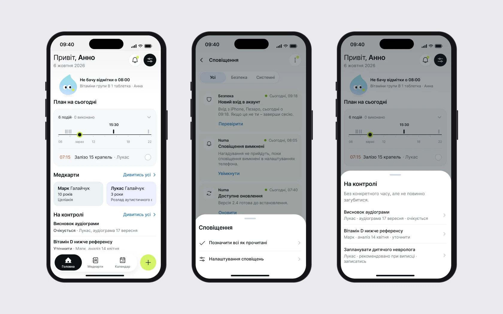
Home shows the day, not a menu
- Why
- The core scenario from the interviews: every day a mom juggles several kids’ medications, her own reminders and appointments. In tests of the first version, participants asked for a helper character and a warmer tone.
- What I did
- A plan on a day timeline with a “now” marker; missed items are highlighted. Tasks without a time go into a separate “Keep an eye on” block.
- Result
- A droplet mascot now voices the state of the day: “I don’t see a check-in at 08:00”. Home answers “what now” instead of pointing to sections.
StatusMascot added after tests of the first version. The day plan is in the MVP prototype.
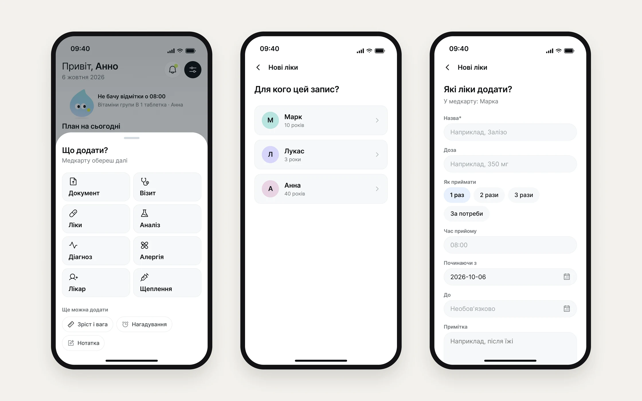
One “+” for 11 entry types
- Why
- Entries belong to different people. An “add” button in every section would make people first look for where the entry belongs.
- What I did
- “What to add?” → “For whom” → form. People think about the event, not about where to store it.
- Result
- All 11 types are added through one path – no separate button in every record and section.
StatusThe decision is in the MVP prototype. In the first version’s tests most people first looked for “create” at the top, so the “+” stayed for everyday entries, and the first record got its own explicit entry point: in onboarding and in the row of records.
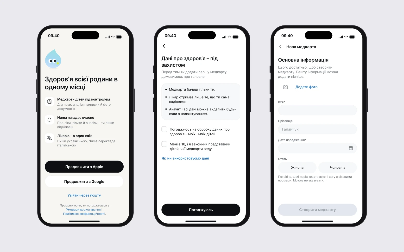
No password, consent as its own step
- Why
- In the first version’s tests a wrong password was part of the scenario: participants got through recovery without trouble, but reached for the more visible Google sign-in, and some wanted to reset the password straight away. And the data is about children and health – consent can’t be small print.
- What I did
- Apple, Google or an e-mail code. Consent and 18+ confirmation before the first health record.
- Result
- The first record starts with three fields – name, date of birth, sex. The rest is added gradually.
StatusPassword removed after tests.
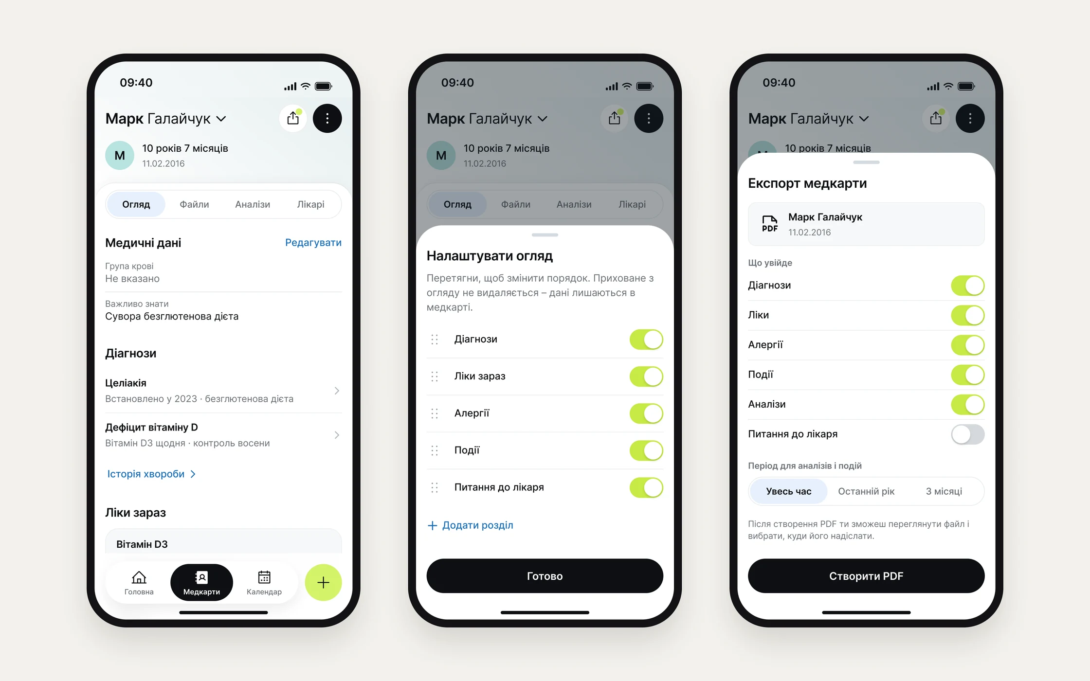
A health record you can hand to the doctor
- Why
- What matters differs for each child, and at an appointment it has to be passed on fast, sometimes in another language.
- What I did
- Overview sections are customizable, export builds a PDF, and the letter to the doctor fills in contacts and helps with translation.
- Result
- The record became a document for the appointment, not just an archive: PDF and a letter to the doctor from one screen.
StatusPart of the MVP scope.
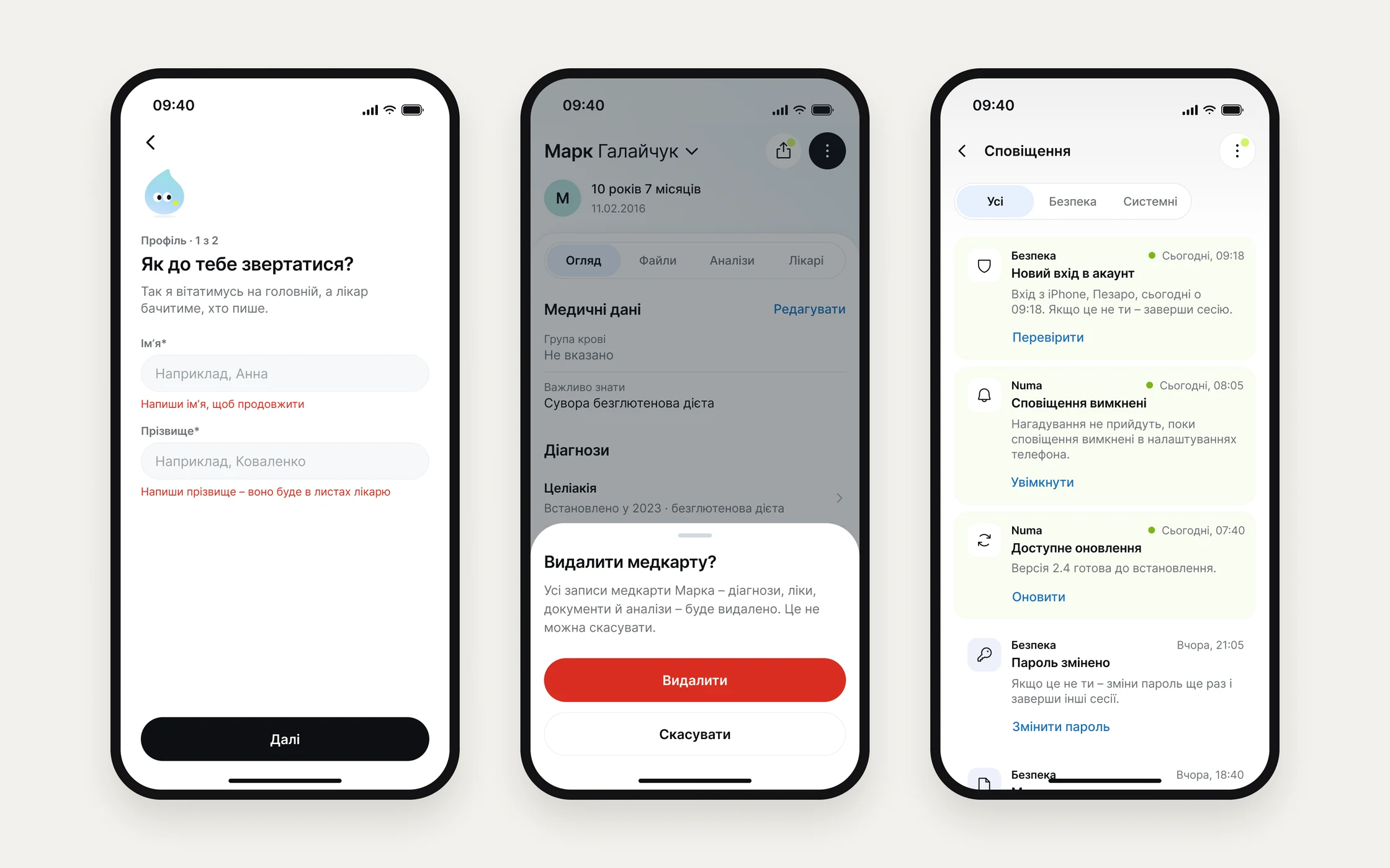
States and system
A third of the screens are off the happy path: empty states, errors with explanations, confirmation of irreversible actions, system notifications. Everything is built from the UI kit: 34 components, 4 variable collections, 19 text styles. Each person’s colour is a supporting cue in the records and the calendar, but not the only way to tell people apart. A prototype limitation: in the new-account scenario it kept only one added record – critical for families with several children, so multiple records need checking before the next round of tests.
Prototype
Adding a medication: one «+» for every entry
Screens from the Figma design: «+» → «What to add?» → «For whom» → the medication form. It plays on its own, with the error on an empty name; switch to «Try it yourself» to click through it.
- Home
- What to add
- For whom
- Medication form
- Error: empty name
- Name and twice a day
- Medication added
- 01
I’m building the app myself: Expo and Supabase with data in the EU.
- 02
Test the single “+”, the new onboarding and the doctor-ready record with people – none of them has been tested yet.
- 03
After the MVP – Numa AI: I’m already structuring the record so every fact has a source.