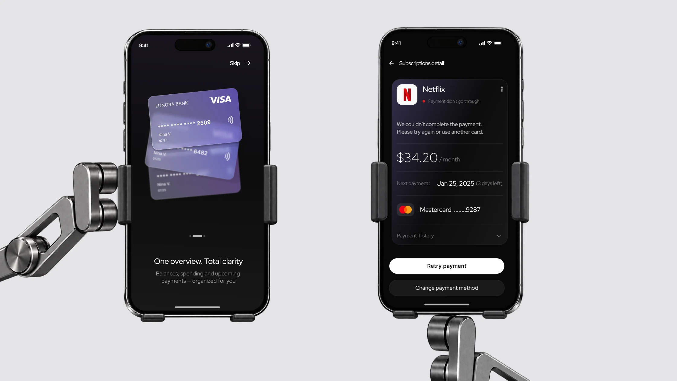
Lunora is my own project where I went through the full cycle: a survey, desk research, a hypothesis, scenarios, states, a UI kit, four usability tests of the prototype and a metrics plan. The focus is on what study projects usually skip: errors, timeouts and retries.
What the research showed
An analysis of banking and subscription managers showed the same: processing is often “empty”, and an error with no next step erodes trust. Hence the hypothesis: explaining the status, the reason and the next action gives people more sense of control.
Have seen a charge for a subscription they forgot about
8 of 9 use two or more cards or accountsWant one app for subscriptions, bills and spending
Four of them – if the interface is simpleCautious about AI: “depends on security”
No one is negative. 6 would trust it more if features could be turned offChose a neutral tone: “Your spending went up by 10%”
4 of 9 name stress as the hardest part of managing moneyNamed financial advice as their main need
So AI is a contextual explanation, not a central chatbotWant to avoid unexpected charges
9 of 9 manage money through banking appsThe sample is small and homogeneous: all nine are employed, eight are aged 21–40. It gives a direction for decisions, not a test of the hypothesis.
From insights to decisions
| What we learned | Decision |
|---|---|
| Several financial sources | One dashboard and a wallet selector |
| Forgotten subscriptions | A subscription overview, next payment date, reminders |
| A request for simplicity | Key information first, a restrained hierarchy |
| Advice isn’t the main priority | A contextual AI explanation instead of a central chatbot |
| Uncertainty about payment status | Separate states with matching explanations and actions |
Payment states
Each state answers three questions: what’s happening now, why it happened and what to do next.
Status, next payment, payment method
An explanation instead of an empty loader, background actions blocked
A short confirmation and a quick close
No blame: Retry payment or Change payment method
Separate from Failed: the status isn’t final yet, don’t pay again
Retry / Change method → back to Processing
Updated status and the next payment date
Processing explains what’s happening
- Why
- Two of the four participants in the prototype test said that payment processing took too long. That made me look not only at the waiting time but at how the interface tells people what state the operation is in: when you don’t understand what’s happening, the wait feels longer and creates uncertainty.
- What I did
- Before, the steps “Checking card → Confirming payment → Almost done” were just text. I added a progress ring and checkmarks on completed steps, and highlighted the next step. There are no percentages: the duration depends on external payment systems.
- Result
- You can see which step the payment is on and that it’s moving forward, not stuck.
StatusThe changes are in the prototype. Retesting hasn’t yet confirmed how well they work.
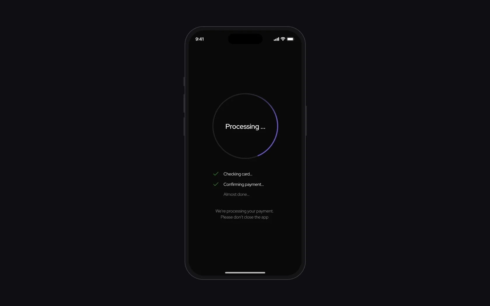
 Before testingAfter testing
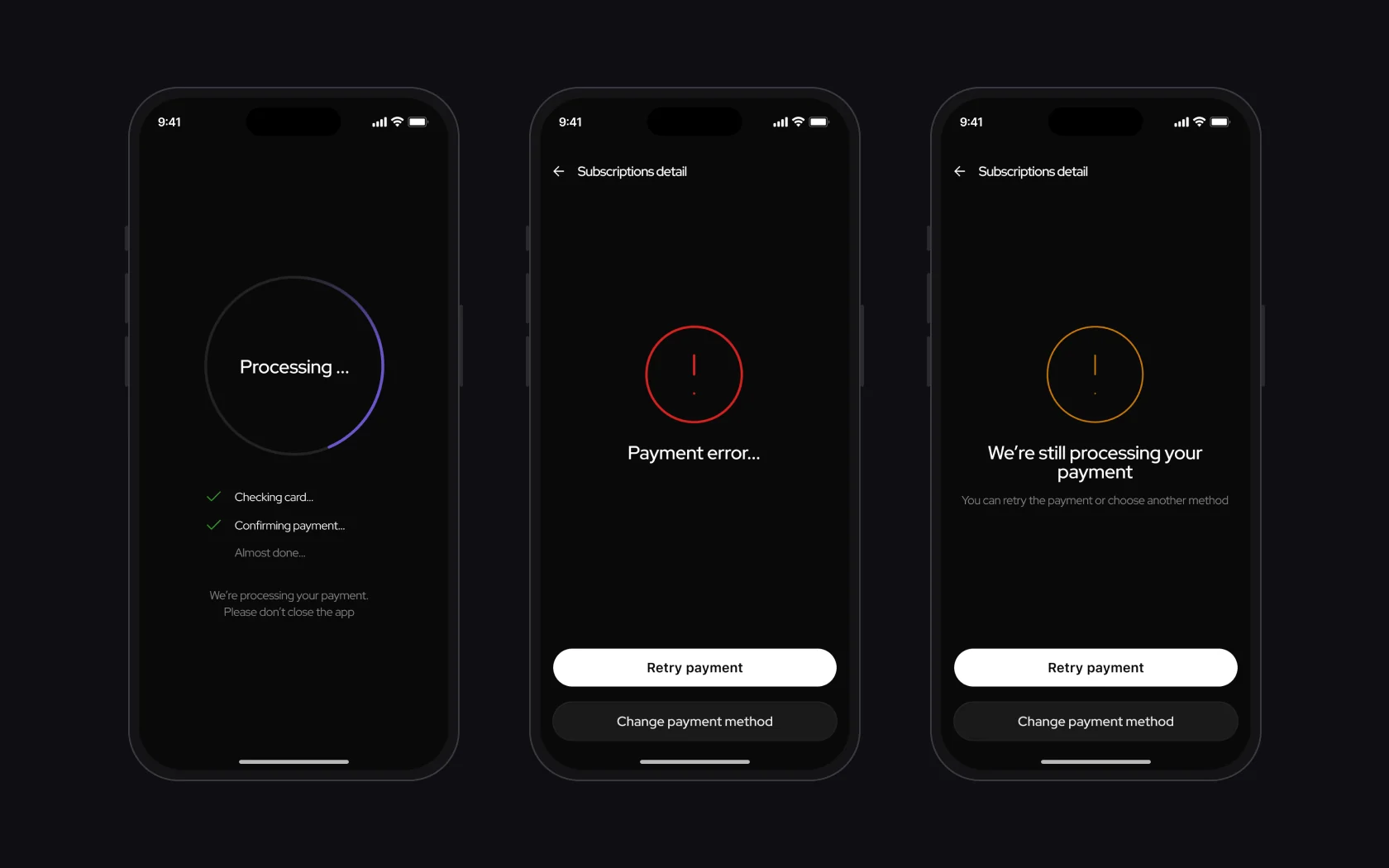
Timeout isn’t Failed
- Why
- During a timeout, people don’t know whether the money was charged and aren’t sure whether to repeat the payment. If the timeout is shown as an error, they may pay twice.
- What I did
- Two different states. Failed – a no-blame message and two actions: Retry or Change payment method. Timeout – a neutral “We’re still processing the payment”.
- Result
- A timeout no longer looks like an error, so there’s no reason to pay twice.
StatusA shared pattern in the UI kit with the same CTA logic.
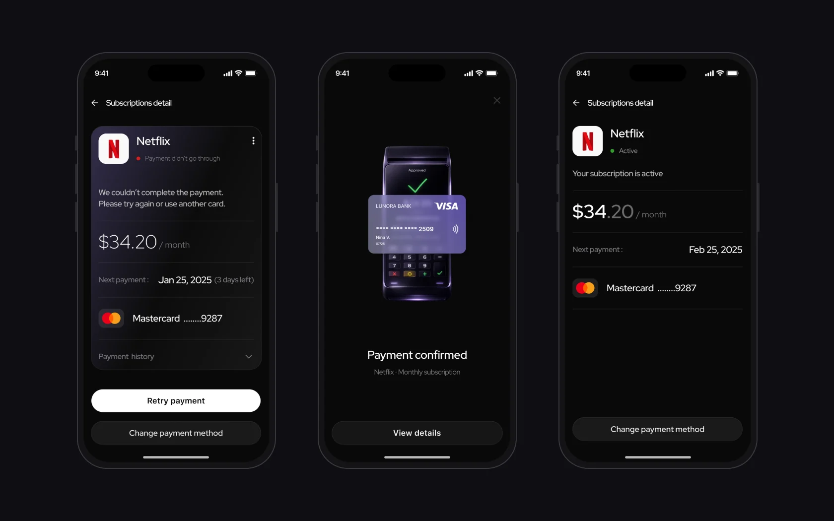
A next step in every state
- Why
- When a payment fails, people don’t see a clear next step and don’t know when the subscription will be active again.
- What I did
- Subscription details show the status, amount, next payment date and method. After success – a short confirmation and a return to Active with the new date.
- Result
- After any payment outcome, people know whether the subscription is active and when the next payment is due.
StatusIn the prototype with Smart Animate.
Onboarding and wallets without pressure
- Why
- Finance apps often add pressure, and 4 of 9 respondents name stress as the hardest part of managing money.
- What I did
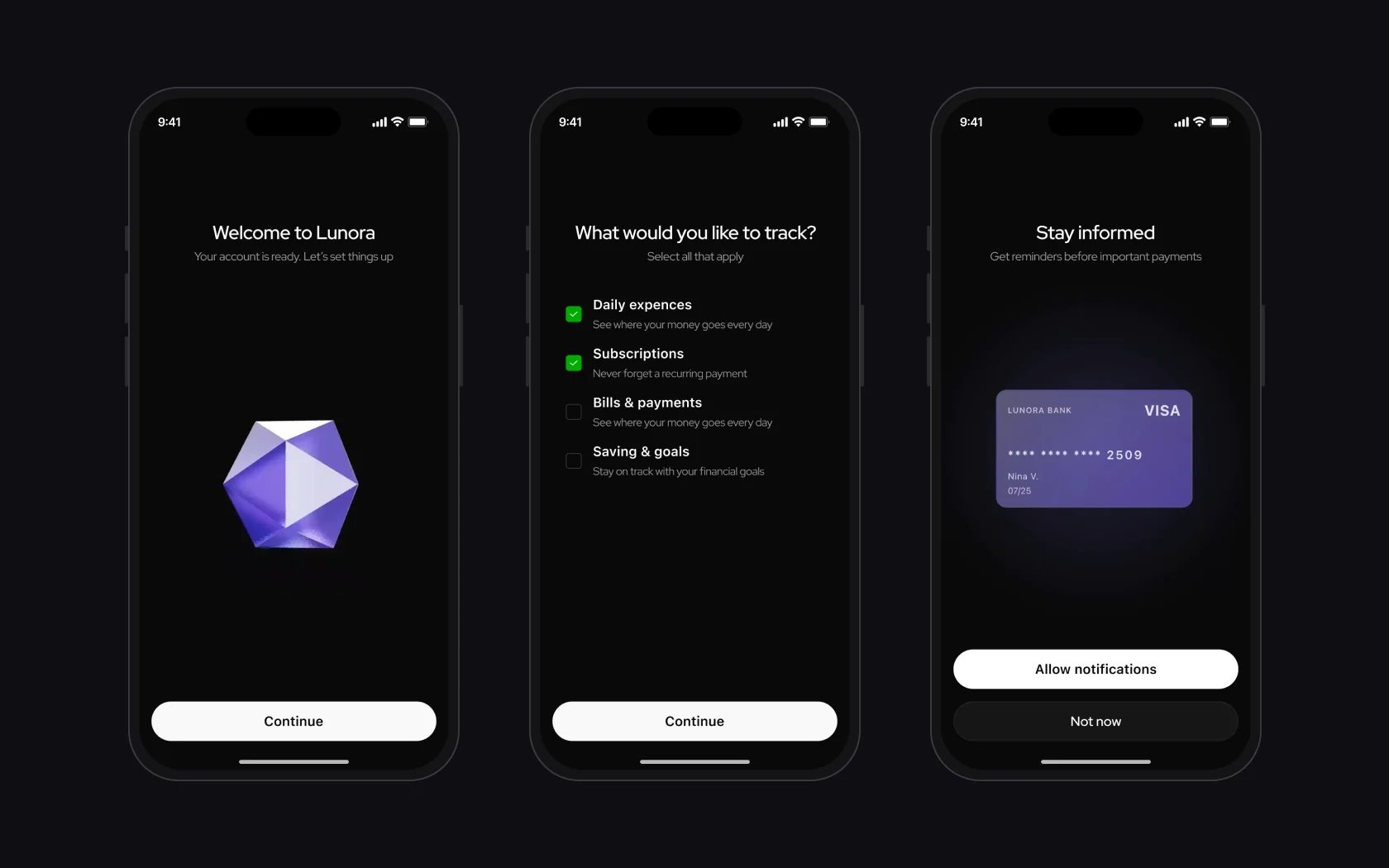
- Onboarding asks what the person wants to track, the notification request explains the benefit, and a wallet can be connected or skipped.
- Result
- People choose what to connect and when, with no mandatory steps.
StatusIn the prototype.
In finance there are often two right answers. Here is what I was choosing between and what won.
| Between | What I chose | Where |
|---|---|---|
| Speed and safety | Intentional friction where a mistake is costly: background actions are blocked during processing | Processing |
| Clarity and cognitive load | Information is revealed progressively | Subscription details, onboarding |
| Automation and control | Critical actions stay explicit and visible | Retry, Change payment method |
| Detail and a quick finish | A minimal success state to close the scenario quickly | Success |
AI is a helper, not the source of truth
AI is meant as a contextual helper: a short explanation of the current situation and the available actions in a bottom sheet. It doesn’t decide on its own whether a charge went through: statuses have to come from reliable payment infrastructure, and the concept has no such integration.
Progress indicators
In Lunora I separated two kinds of processes: the initial product setup and the processing of financial transactions.
- Wallet setup – determinate progress
- The Setting things up screen uses a 0–100% indicator, which in the prototype shows the expected interface behaviour during setup. In the real product this indicator has to be tied to the actual completion of the steps. If the backend can’t provide reliable progress data, an indicator without percentages is planned.
- Payment processing – indeterminate progress
- While a payment is being processed, the duration depends on external payment systems. A percentage indicator could therefore create a false expectation of when it will finish. For this scenario I chose a status interface that explains the current step, without artificial percentages.
The principle: a progress indicator has to show reliable information, not create an illusion of control.
Accessibility is built into the system: high contrast in the dark UI, a clear type hierarchy, large tap targets and short “what happened → what to do” messages. There haven’t been tests with assistive technologies yet – next come a WCAG review and screen reader flows.
How to measure
These are proposed metrics, not measured results: the product isn’t launched. The next step is usability testing of the prototype on failed payment, timeout and payment method change scenarios.
| Metric | What it shows |
|---|---|
| Status comprehension | Whether people tell Failed and Timeout apart |
| Time to resolve | Time from the problem appearing to it being resolved |
| Payment recovery rate | Share of successful payments after an error |
| Retry drop-off | Share of people who leave the retry flow |
| Duplicate attempts | How often people retry before the result is confirmed |
| Design decision | Expected effect |
|---|---|
| Separate payment states | Less panic, fewer exits from the flow |
| Clear CTAs on every state | Faster decisions, fewer chaotic retries |
| Timeout separate from Failed | Fewer double payments, more trust |
Prototype
Onboarding and connecting a wallet
Screens and animations from the Figma prototype: the intro with a stack of cards, sign-up, the first wallet and the setup progress. It plays on its own; switch to «Try it yourself» to click through it.
- Splash
- Intro: three steps
- Sign-up and preferences
- First wallet
- Wallet type
- PayPal
- Setting things up
- 01
The survey showed interest in one place for finances, but also caution about AI – so the bet is on transparent statuses, and AI stayed an assistant concept.
- 02
Deliberately out of scope: bank integrations, legal scenarios, monetisation and ML implementation.
- 03
Next – test the new Processing and Timeout with people (neither has been retested yet) and measure payment recovery rate and drop-off during retry.